Friends keep us company through the ups and downs of our lives and help us grow. But as we grow older, our fear and social anxiety can keep us from making new friends. Social anxiety not only hit the younger age group but also the older age group too. Circle is a mobile app that is intended to help people with social anxiety and who feel less confident to make new friends.
Why is it designed?
Challenges identified
• Social apps are not equipped to encourage users with social anxiety to make new friends. • Social apps may be overwhelming for older group of users.
Goal
To design a simple, friendly, easy to use app for people who have social anxiety including users with diverse demography, that encourages them to make new friends.
My role
Overview
• UX designer performing - Research, Visuals, Interaction and Motion design from conception to completionfor this app. • Design Tool: Figma, Adobe Illustrator.
Contribution details
• Conducting User Research – Creating empathy maps, Personas, User stories & Journey maps, Defining problem & Hypothesis statements, User Flows, Competitive Audit. • Creating Wireframes. • Creating Low Fidelity prototypes. • Usability Study Plan and Research. • Creating Spread sheet notes and Affinity Diagrams to develop insights. • Creating Sticker sheet, Mockups and High-Fidelity prototypes using Figma. • Accounting for Accessibility and Iterating on the design.
User Research: Summary
I conducted interviews and created empathy maps to understand the users.
Target Audience
Primary user groups identified were adults (within age group of 18 to 60) with: · Social Anxiety. · Low/ Limited technical literacy.
Pain points identified
· Generic – Social apps are not specifically designed to encourage people with social anxiety. · Overwhelming – The apps have a lot of features, tabs, ads and so on which makes it overwhelming for older usergroups. · Navigation and Accessibility – Takes time for certain user groups belonging to older age toget used to navigation and features.
Personas
Persona 1 - Jared Paulson
Problem statement:
Jared Paulson is an introvert adult working as a Barista who needs to be able to make new friends without the fear of being judged because he has social anxiety, he often goes blank when interacting with someone new and there are no social apps that provides an environment to help him make new friends.
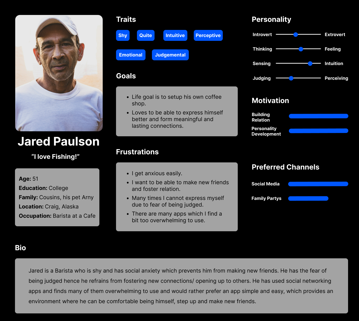
Image – Persona: Jared Paulson
Persona 2 - Lilly Stone
Problem statement:
Lilly Stone is a student pursuing Master’s Degree who needs a socializing app that can help her get more comfortable to from new connections because she gets self-conscious due to social anxiety and refrains from making first approach to talk to new people.
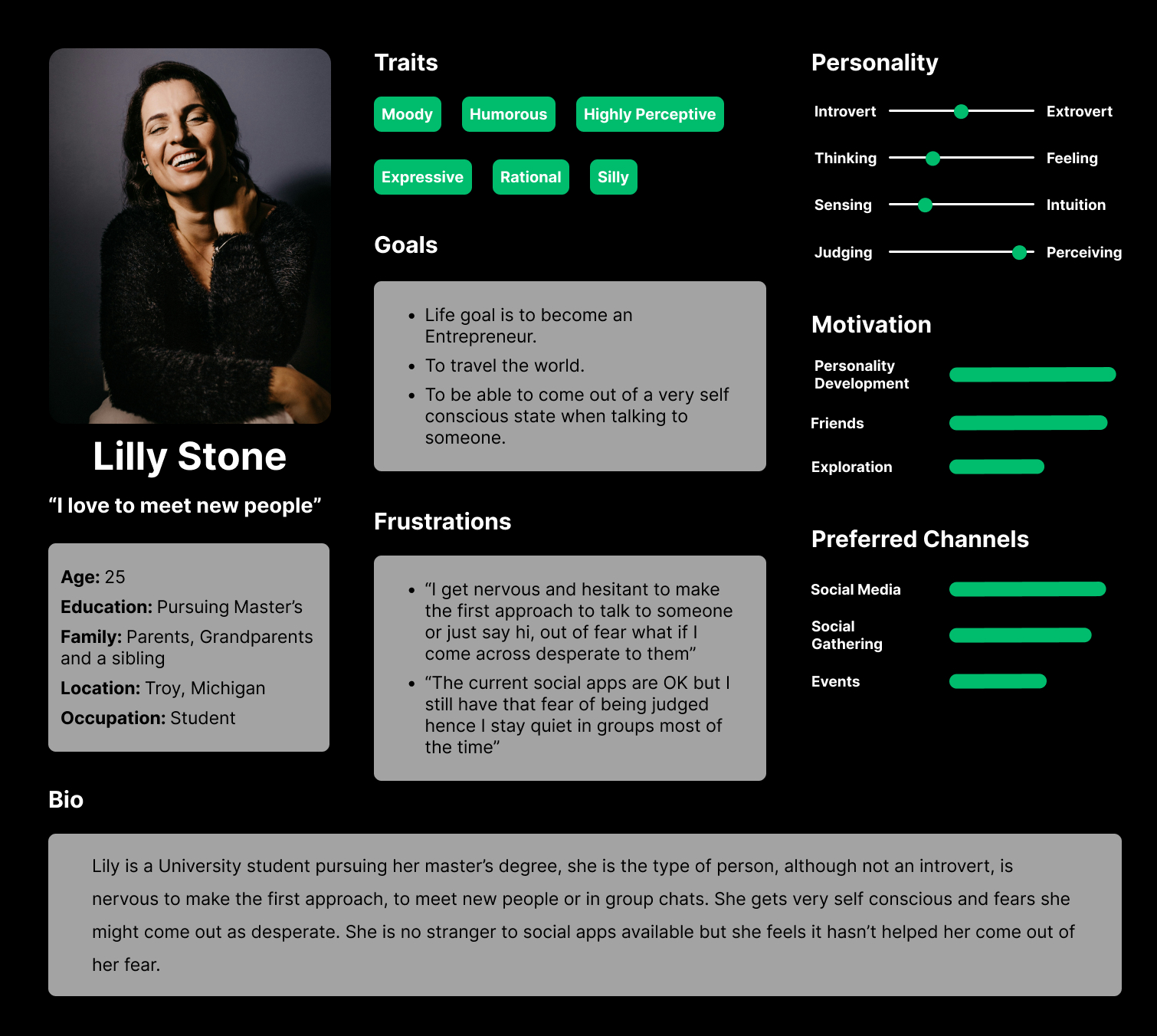
Image – Persona: Lilly Stone
User Journey Map
Mapping user journey revealed how helpful it will be for users to come out of anxiety, and feel more comfortable forming new connections which will only add more colours to their lives.
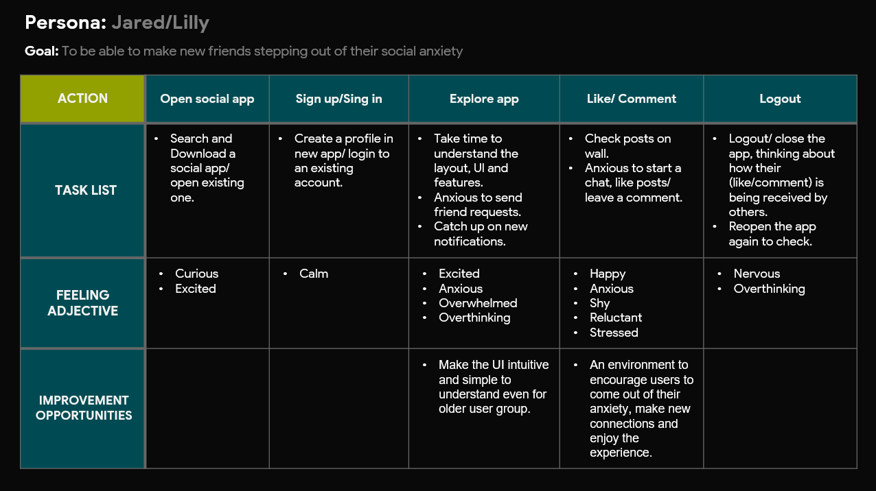
Image - User Journey
Competitive Audit
An audit of few competitor’s products provided direction on gaps and opportunities to address Circle's design.
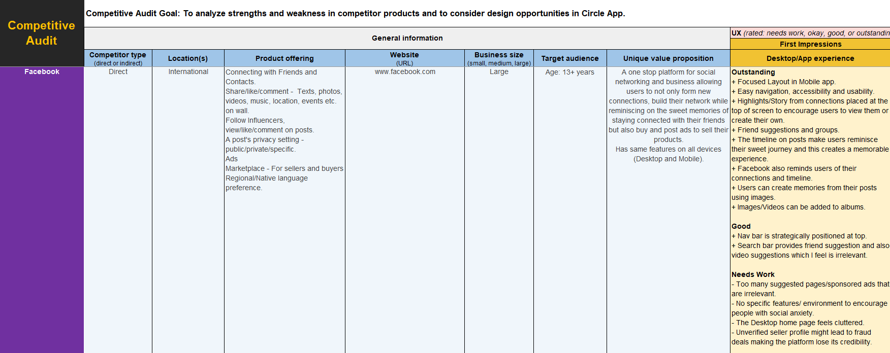
Image (1.a) - Competitive Audit for Circle App
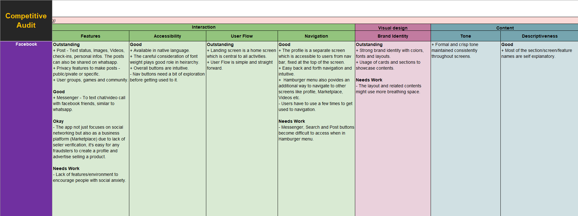
Image (1.b) - Competitive Audit for Circle App
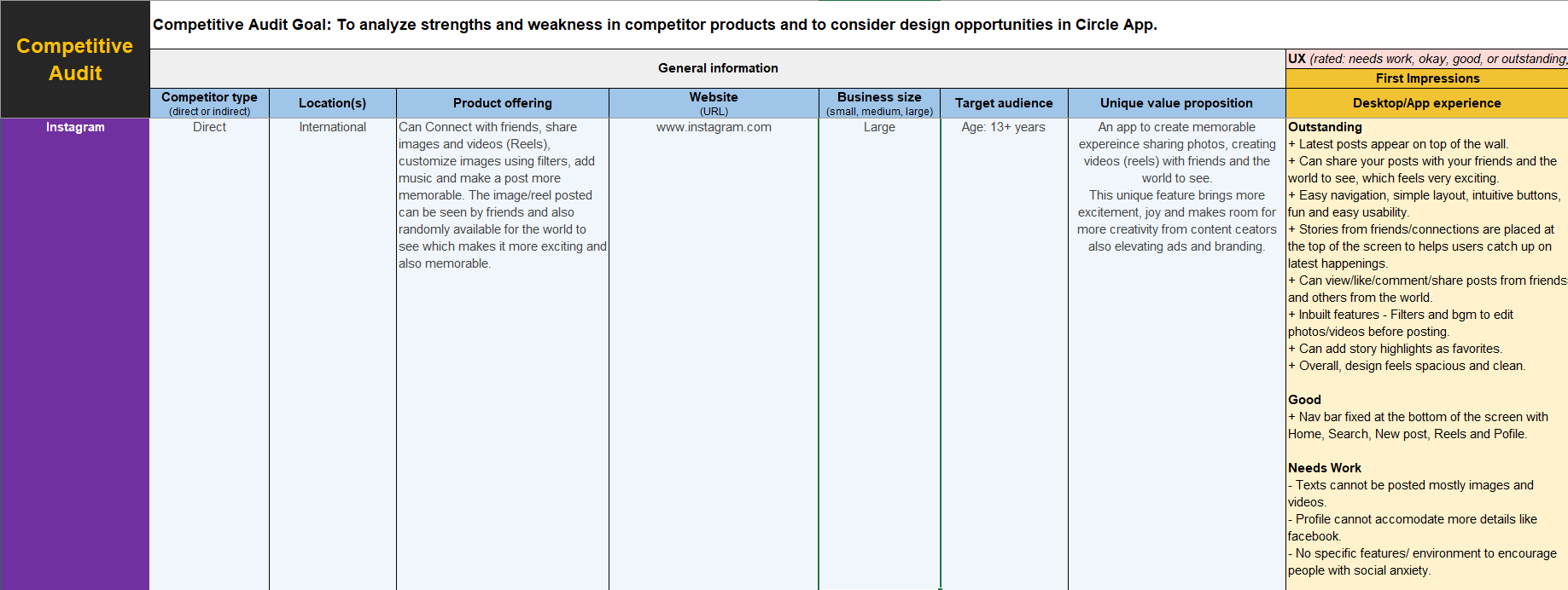
Image (2.a) - Competitive Audit for Circle App
Image (2.b) - Competitive Audit for Circle App
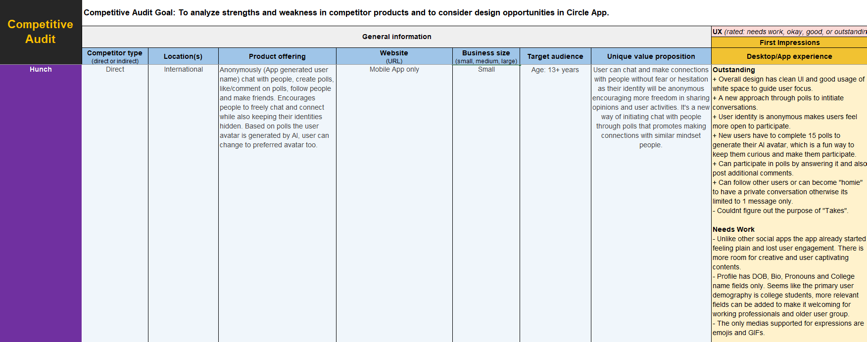
Image (3.a) - Competitive Audit for Circle App
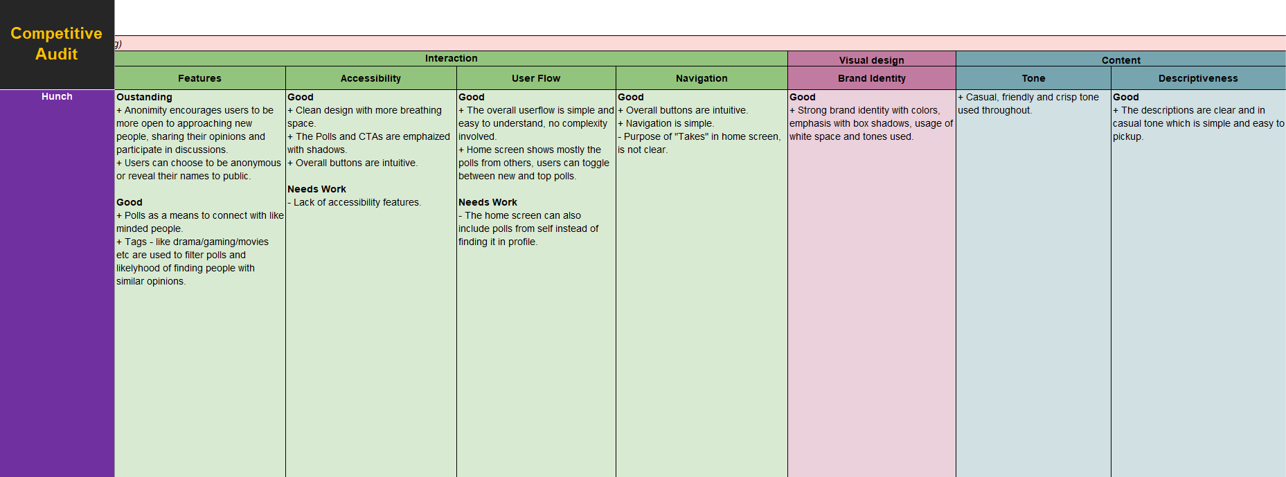
Image (3.b) - Competitive Audit for Circle App
Wireframes
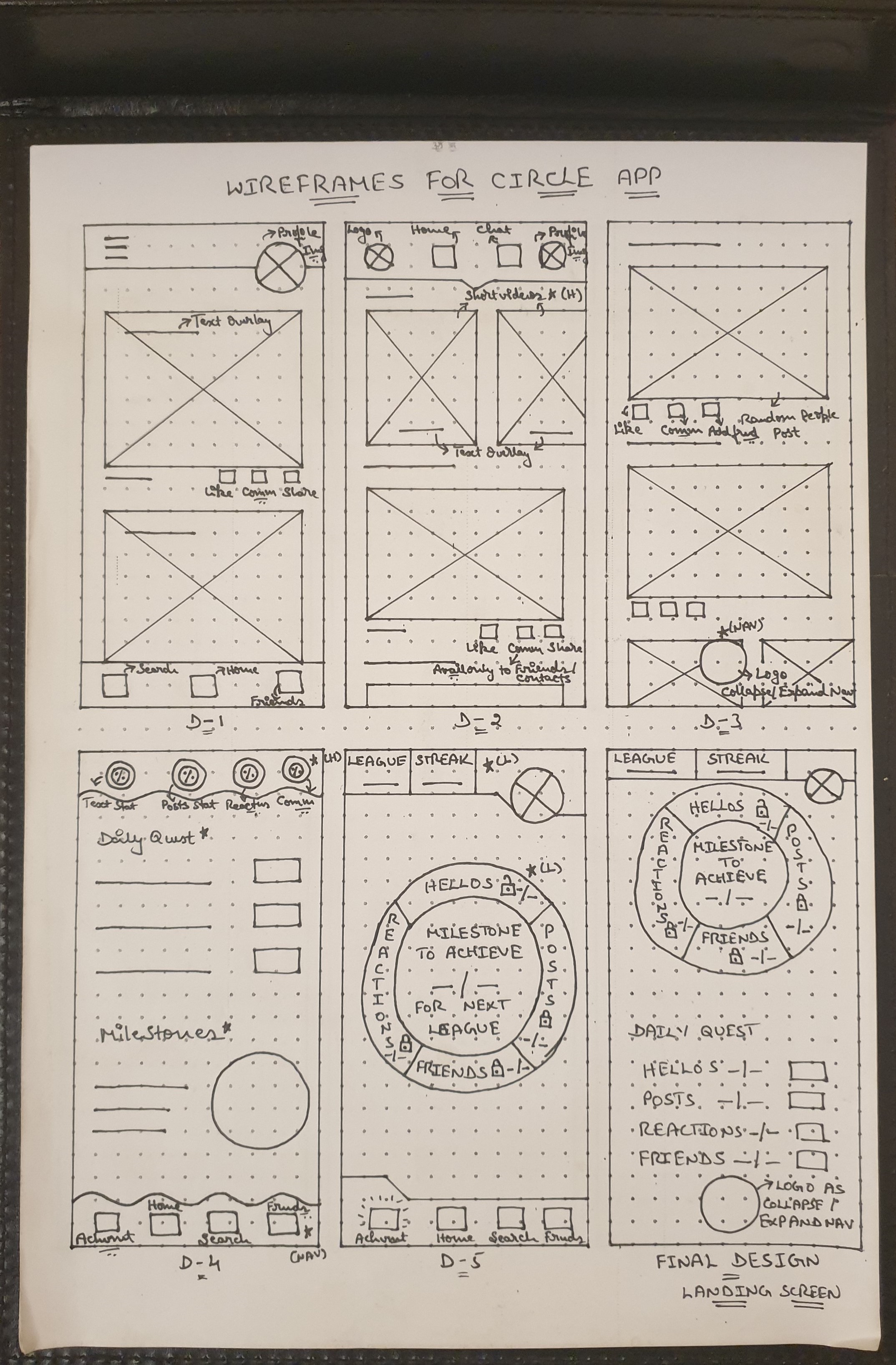
Paper Wireframe
By drafting iterations of a screen in the app on paper ensured that the elements which made it to the final design would be well-suited to address user pain points. I prioritized on making users feel comfortable, encouraged and competitively fun allowing them to go forward and make new connections.
Image - Paper Wireframe of Circle App
Digital Wireframe
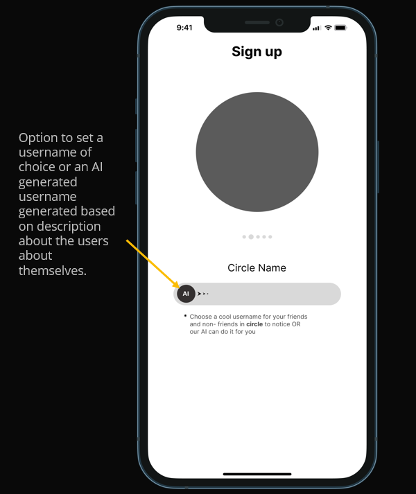
As the initial design phase began, I made sure to base screen designs on findings from user research and competitor analysis. Users with social anxiety are the key consideration made for any and every design decision throughout and using AI as a feature to generate username based on user’s description about themselves is an initial assumption towards a fun, engaging and interactive experience for target users.
Image (1) - Digital Wireframe highlighting this feature
As the design phase continued, I wanted users (focusing those who are first timers) to feel a smoother account setup and post login experience and thus during sign up process I have included the concept of allowing users to select their contents of interest that they would like to see on their wall, to start with.
Image (2) - Digital Wireframe highlighting this feature
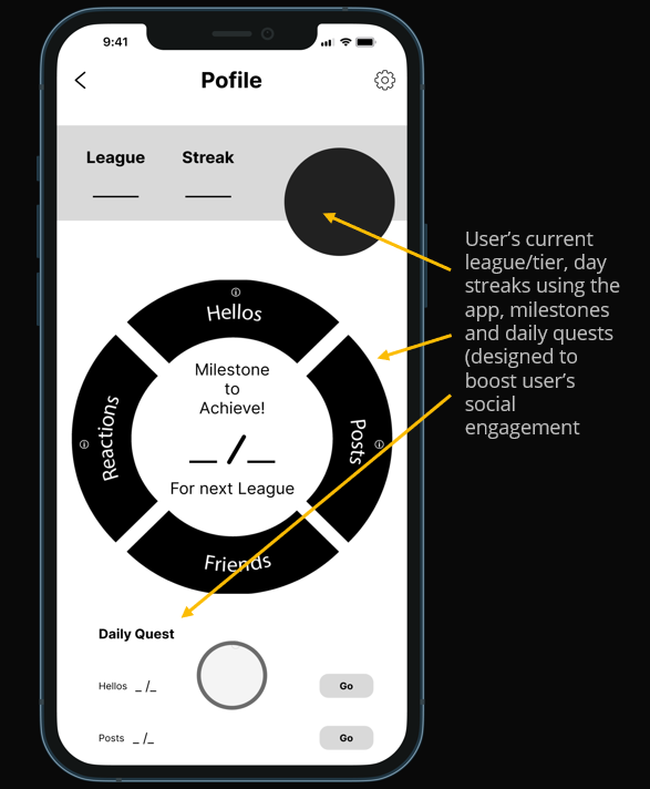
An idea of gamification is introduced showcasing the user’s current league/tier (which shall be divided as bronze, silver, gold etc.), day streaks using the app, milestones and daily quests. This adds a flavour of competitiveness and fun isthe primary assumption made, The achievement progress will showcase on user’sprofiles helping boost their confidence and status propelling them to socialize more.
Image (3) - Digital Wireframe highlighting this feature
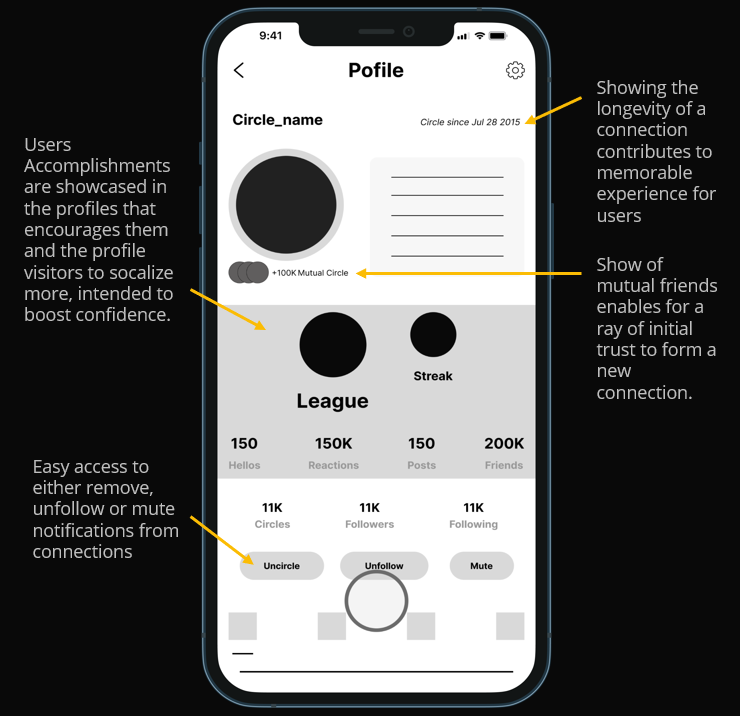
In continuation to league, streak and milestone tasks previously the users’ accomplishments showcased in their profile and the mutual connections (if any) as shown here builds a sense of trust, credibility and positive impression to other users to form new connection. Adding to this, the longevity of a connection helps users reminisce their connection.
For those who want to remove accidental or unnecessary connections easy access to do so is also considered.
Image (4) - Digital Wireframe highlighting this feature
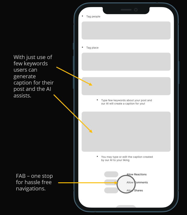
Socially anxious or anxious people in general tend to overthink about their actions orwords or just about anything related to them. Here AI assist is used assuming to be found helpful for users to craft captions for their posts just with few keywords. This can be helpful even to those with language barrier or language literacy, intending to help boost their confidence and pave way for an engaging, memorable and positive user experience. FAB is used for an engaging user experience and hassle-free navigation all from just a fingertip.
Image (5) - Digital Wireframe highlighting this feature
Low - Fidelity Prototype
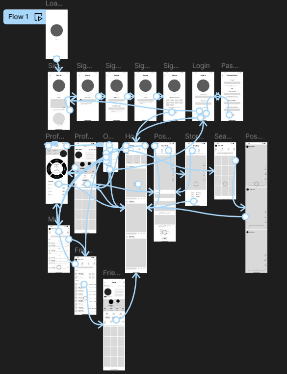
After welcome screen (circle logo) - NEW USERS are navigated through sign up process where they setup their profile, password and choose their contents of interests to be displayed on their wall to begin with. Users can access their profile, achievements (Showcases the tier collective of number of friends made, hellos initiated, posts and reactions to others post by completing daily quests designed to encourage socially anxious users to form new connections), friends list, messages and posts from others through a FAB (Floating Action Button) central to all navigations. The AI shall optionally assist users to pick a cool name for them and also assist to create captions for their posts. Users can post pictures, videos and stories similar to what other social medias offer.
("Design changes" can be found under usability study)
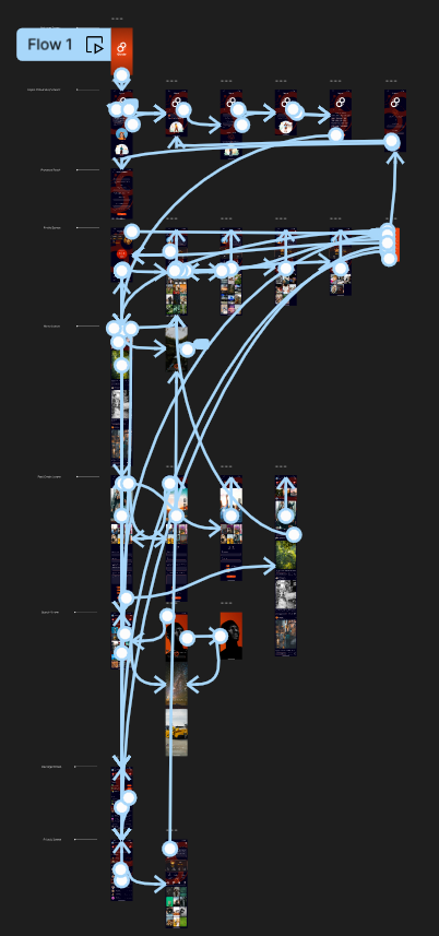
Image- Low Fidelity Prototype of Circle App with links connecting all the screens
Usability Study finding
No.of participants – 5
Round 1 Findings Summary
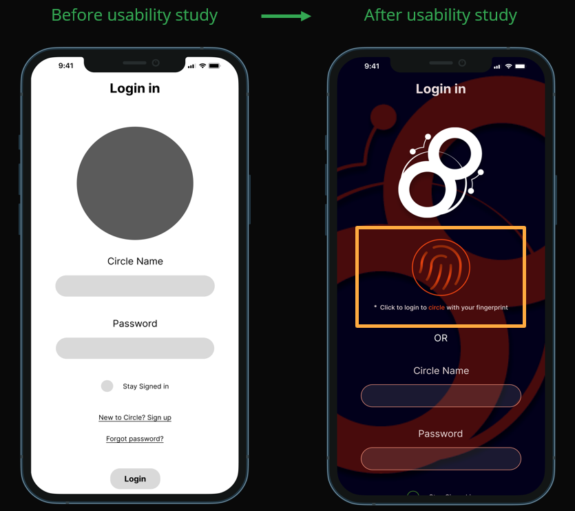
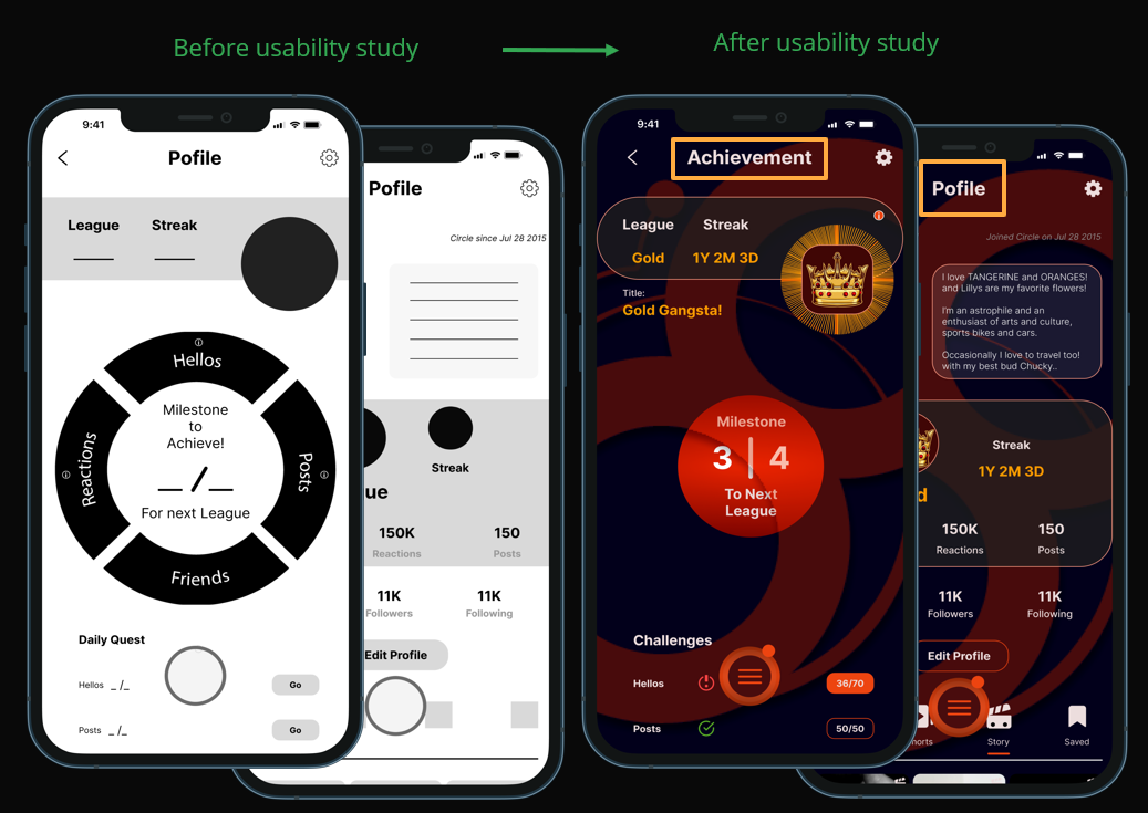
· Fingerprint sign in, an alternative to password as a means of convenient, fast and secure login. · Achievements and profile screens are now separate, found useful for users to better distinguish between two screens.
· Daily quest now has indicators of completion and pending milestone. This indication helps users feel both encouraged from the completed tasks and compelled to finish the pending ones.
· Notifications reflect in both FAB and Menu overlay too (ex: Circle and Chat notification highlights).
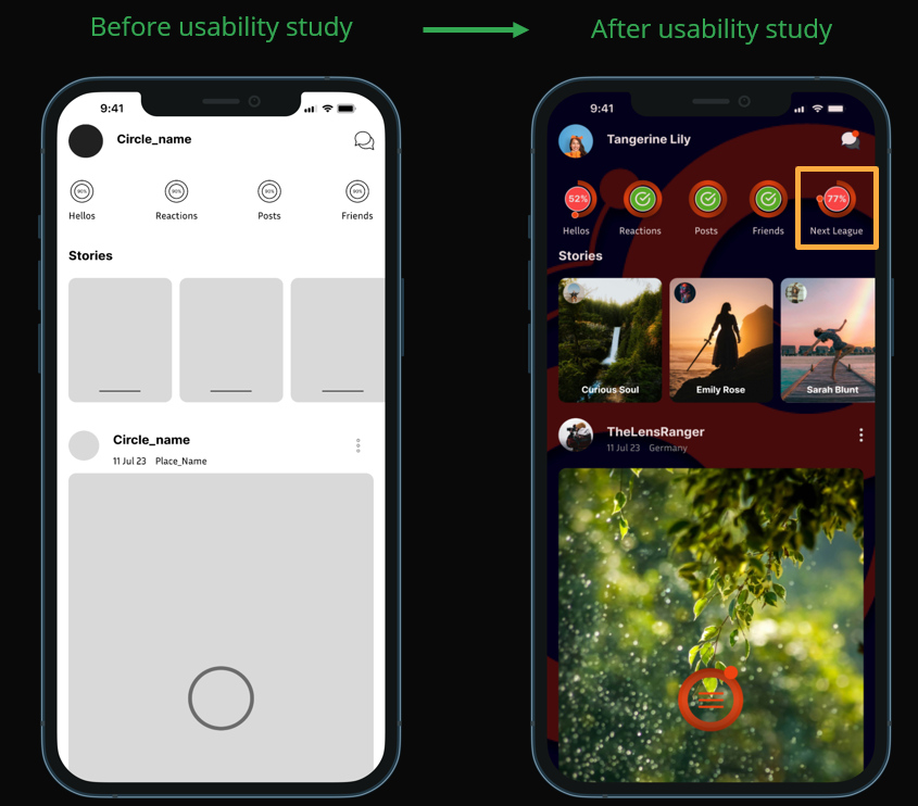
· Added progress indicator to Next League.This helps users to track their progress and encourages to reach goals.
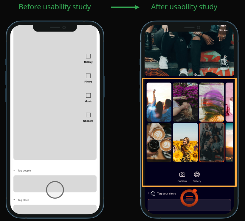
· Added gallery and camera buttons at the bottom, and the top media files (Images and videos in gallery) are suggested for users to make a quick pick.
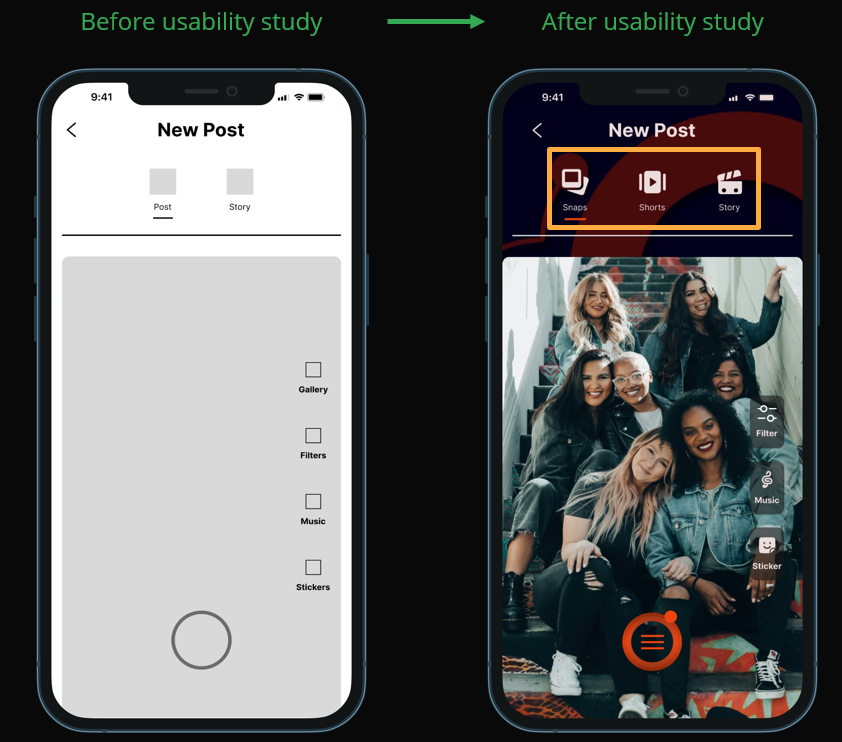
· More discrete tabs - Like Snaps, Shorts and Story. It was observed during usability study that the earlier design caused confusion.
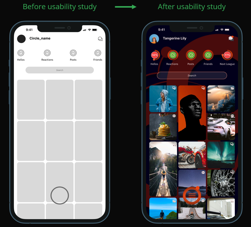
· Used Bento grid for posts in Search screen which is the current trend and also keeps users engaged.
· Fullscreen view of a post - an added feature.
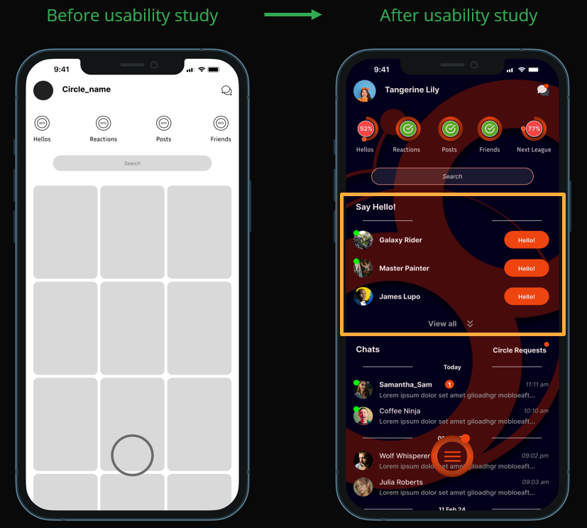
· Earlier assumption was any chat would be considered as "hello" count but this did not encourage users from reaching out to new people (someone out of their circle), hence added “Hellos”,a one click reach out to strangers, encouraging users to reach out to newpeople.
· Minor description changes example - before study "Tag People" after study "Tag your Circle". This description was clear and more specific.
Design changes
Early designs allowed for some customization as follow -
The initial design paved way for further discovery of design direction during usability study and the research participants provided insights on their concerns and added suggestions that would make their experience better.
Primary suggestion was fingerprint registration which was a better alternative to remembering passwords and reset them in case forgotten. Also, it was understood during the design process that having two options to sign in was better in case either one fails due to technical reason or user actions.
Image (1) - Final design of Circle App highlighting design changes
Duringthe usability study the achievement screen (earlier known as profile screen) caused confusion to users while navigating, the design decision was to let users know achievement was a part of their profile. The achievement and profile screens are now discreet.
Image (2) - Final design of Circle App highlighting design changes
It was observed after the usability study that if the users could also have a view of their completion towards next league (collective of individual quests) it would promote a sense of competitiveness and also create an encouraging environment to help them complete quests, in turn helping them overcome their limiting beliefs. Hence the next league progress has been added in the quest progress.
Image (3) - Final design of Circle App highlighting design changes
In the earlier design Post tab was inclusive of both Snaps and Shorts and Story was a separate tab. It was brought to light that this caused confusion, duringthe usability study. Hence Snaps, Shorts and Story are made discreet so users are aware of the tab they are selecting resulting in no confusion on the type of content they want to post on their wall.
Image (4) - Final design of Circle App highlighting design changes
The option to click image through camera and post wasn’t available and gallery was included in the post edit panel with an assumption that its easy to access it since its on top of screen.
During the design considerations for making better use of access to post from gallery and camera, they were added below and the top media files (Images and videos from gallery) were suggested for users to make a quick pick. This gave users 2 options –
1. To be able to make a quick pick for their post from recent media. 2. Camera and Gallery options provided additional access tocreate/post their contents.
Image (5) - Final design of Circle App highlighting design changes
Used Bento grid to make the UI more engaging, allowed users to experience a better view of posts from people across
Image (6) - Final design of Circle App highlighting design changes
In the initial design any message or chat would be considered for a “Hello” count but this did not encourage users to reach out to new people and form connections. Instead it made them stay in their comfort zone since the purpose of this app is to elevate the users to make new friends, Hello is added as a 1 click initiative chat with a person outside circle encouraging users toeach out to new connections. The “Hello” count is also added to milestones along with other actionable quests to be completed to reach next league and show-off on their profile as an accolade.
Image (7) - Final design of Circle App highlighting design changes
Mockups
Sample mockup images from the app
Image - Circle App Welcome Screen
Image - Circle App Home Screen
Image - Circle App Friend Profile Screen
Image - Circle App Friends List Screen
Image - Circle App Chats Screen
High - Fidelity Prototype
The final high-fidelity prototype presented smooth userflows - to sign up, view and create posts, friend requests and chat, viewprofile, accomplishments and very importantly to complete actionable quests that are specifically designed for the target users (Users with Social Anxiety).
It met the user needs basis initial usability studies while also providing ease of use for older user group.
Image- High Fidelity Prototype of Circle App with links connecting all the screens
· Friendly tone, intuitive buttons and icons for ease of use. · The screens include explicit headings and texts indicating landmarks for easy navigation. · Designed with adequate use of white space for better readability and usage.
Takeaway
Impact
The app’s intended to help users with social anxiety offers an environment where they feel encouraged to make new connections, with a memorable and engaging experience.
What I learned
While designing Circle app, I learned that the first ideas for the app are only the beginning of the process. Usability studies influenced each iteration of the app’s design and how a simple design change can also significantly impact user’s experience.
Next Steps
Conduct further rounds of usability studies to validate whether the pain points are effectively being addressed with an intention to explore and bring new design ideas that help elevate user experience.
THANK YOU!
For your time reviewing my work on Circle Mobile App. If you’d like to get in touch, please fill the form below and I will get in touch with you :-)